Illustrations
Friday, 22 July 2011
Wednesday, 12 January 2011
When and how was the first ever book in Europe printed?
The Gutenberg Bible was the first major book printed with a movable type printing press marking that was to be the start of the age of the printed book. The book was printed by Johannes Gutenberg, in Mainz, Germany in the 1450s. Only twenty-one complete copies survive, and they are considered by many sources to be the most valuable books in the world, even though a completed copy has not been sold since 1978.
The Gutenberg Bible is printed in the black letter type styles that would become known as Textualis and Schwabacher. The inks used by scribes to produce manuscripts were water-based. Gutenberg developed an oil-based ink that would better adhere to his metal type. His ink was primarily carbon, but also had a high metallic content, with copper, lead, and titanium predominating.
A single complete copy of the Gutenberg Bible has 1,272 pages; with 4 pages per folio-sheet, 318 sheets of paper are required per copy. The 45 copies printed on vellum required 11,130 sheets. The 135 copies on paper required 49,290 sheets of paper. The handmade paper used by Gutenberg was of fine quality and was imported from Italy. Each sheet contains a watermark, which may be seen when the paper is held up to the light, left by the papermold.
Gutenberg made three significant changes during the printing process. The first sheets were rubricated by being passed twice through the printing press, using black and then red ink. This was soon abandoned, with spaces being left for rubrication to be added by hand.
references:
http://en.wikipedia.org/wiki/Gutenberg_Biblewww.ideafinder.com/features/.../won-printbook.htm
nventors.about.com/od/gstartinventors/a/Gutenberg.htm
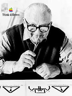
Graphic Communicator: Paul Rand
I would choose Paul Rand to be my favourite graphic communicator, his book, Thoughts on Design contained reproductions of almost one hundred of his designs and some of the best words yet written on graphic design. He designed many posters and corporate identities including the logos for IBM and ABC. He had also completed designs for several other companies including Esquire, Coronet Brandy, and Robeson Cutlery.
Rand was most famous for the corporate logos he created in the 1950s and 1960s; his early work in page design was the initial source of his reputation. In 1936, Rand was given the job of setting the page layout for an Apparel Arts magazine anniversary issue, his talents were quickly noticed and earned Rand a full-time job, as well as an offer to take over as art director for the Esquire-Coronet magazines.
Rand's design experience has paralleled the development of the modern design movement. Paul Rand's first career in media promotion and cover design ran from 1937 to 1941, his second career in advertising design ran from 1941 to 1954, and his third career in corporate identification began in 1954. It was said that Rand was a realist using the language of the poet and the businessman. He thinks in terms of need and function.
He was cited as one of the ten best art directors by the Museum of Modern Art. This was the same year in which he received the gold medal from the Art Directors Club for his Morse code advertisement addressed to David Sarnoff of RCA.
References:
Subscribe to:
Comments (Atom)


